Case Study - Discovery-Led Redesign of Financial Transactions in a Large-Scale Gaming Platform
Research-driven discovery solving a payment flow after five previous attempts failed. Clear synthesis surfacing core issues before costly implementation.
- Client
- Gaming Platform
- Service
- UX Design & Discovery
Overview
I joined as Senior UX Designer when the platform was struggling with widespread payment and onboarding issues. Through synthesis of research, support data, and newly available usability recordings, I uncovered a single structural mismatch driving all reported problems.
The redesign adjusted payment and onboarding flows to match how users actually behaved. To achieve this, I designed, tested, and introduced a reusable transaction pattern that allowed modular steps to be used across checkout, account setup, and other entry points without breaking navigation or user intent. This work enabled more than five previously blocked features, significantly reduced payment-related support requests, and contributed to the app rating increasing to 4.4 over the following year.
The Problem
After launch, users frequently got lost during signup and payments and could not return to their intended purchase. Over 70% of support calls were payment-related, and the app rating dropped to 2/5.
Fixes that did not move the metrics
Multiple fixes were attempted, but none improved key outcomes such as Time to First Purchase.
- Help banners and links
Ignored. Users still got stranded after completing steps.
- Redirect sequences
The system could not track user state consistently.
- Progress indicators
Time to First Purchase did not improve.
From limited visibility to synthesis
Due to sensitive financial information, screen recordings were prohibited on transactional flows. Issues appeared scattered across teams, and while a deeper structural problem was suspected, there was no way to prove it.
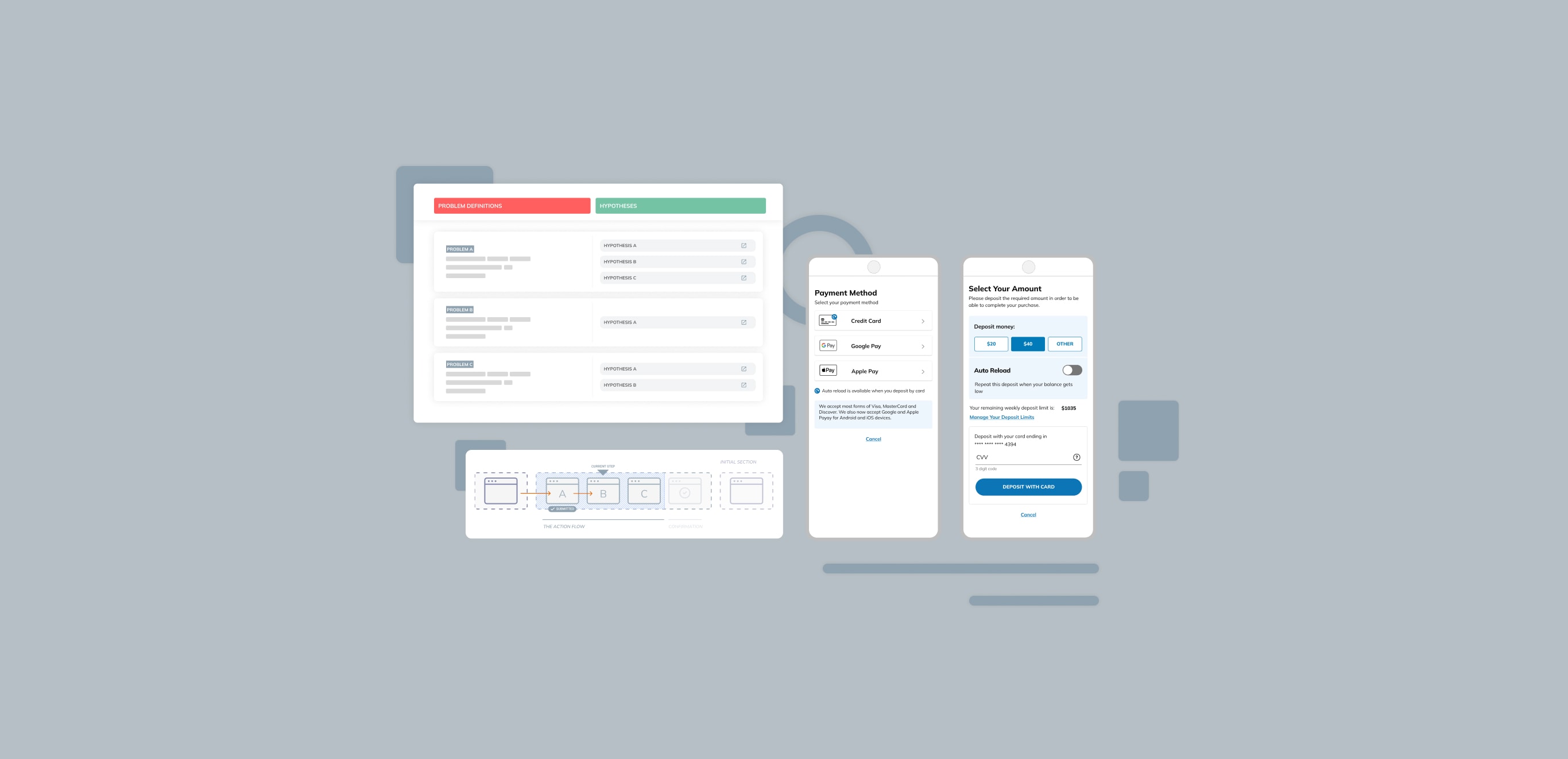
This changed when moderated usability sessions using demo accounts provided the first end-to-end view of user behavior. I consolidated usability recordings, support tickets, and product metrics into a problem hypothesis canvas, mapping symptoms to observed behavior and testing competing explanations.
Through this synthesis, a consistent pattern emerged: users were diverted away from their original intent, and the system had no reliable way to return them.
Final problem statement
Users came to the platform expecting to discover a game, decide to buy, and complete that purchase in one continuous flow. The platform, however, was built around an account-first assumption, requiring users to complete account creation and payment setup before purchasing. This structural mismatch broke purchase continuity by redirecting users into separate account flows with no reliable way to return, leading to abandoned transactions, frustrated users, and a high volume of payment-related support calls.
The Approach
Aligning on the most critical path
Once the mismatch was clear, the first step was securing buy-in to pursue a structural solution. I reframed the problem around the platform's most critical path: the game checkout flow, making the impact on revenue, support volume, and ratings explicit.
At the same time, the solution could not be checkout-specific. It also had to work for account setup and other entry points, or the same fragmentation would reappear elsewhere.
Translating insight into a reusable direction
I presented the synthesized evidence through annotated walkthroughs tied to usability findings, support data, and metrics, creating shared alignment across product, design, and engineering.
With alignment in place, I worked closely with engineering to define a reusable transaction pattern that preserved user intent across checkout and account setup while respecting backend constraints. We focused on flow logic and system states before committing to detailed UI, allowing feasibility to be validated early and in parallel.
The Solution
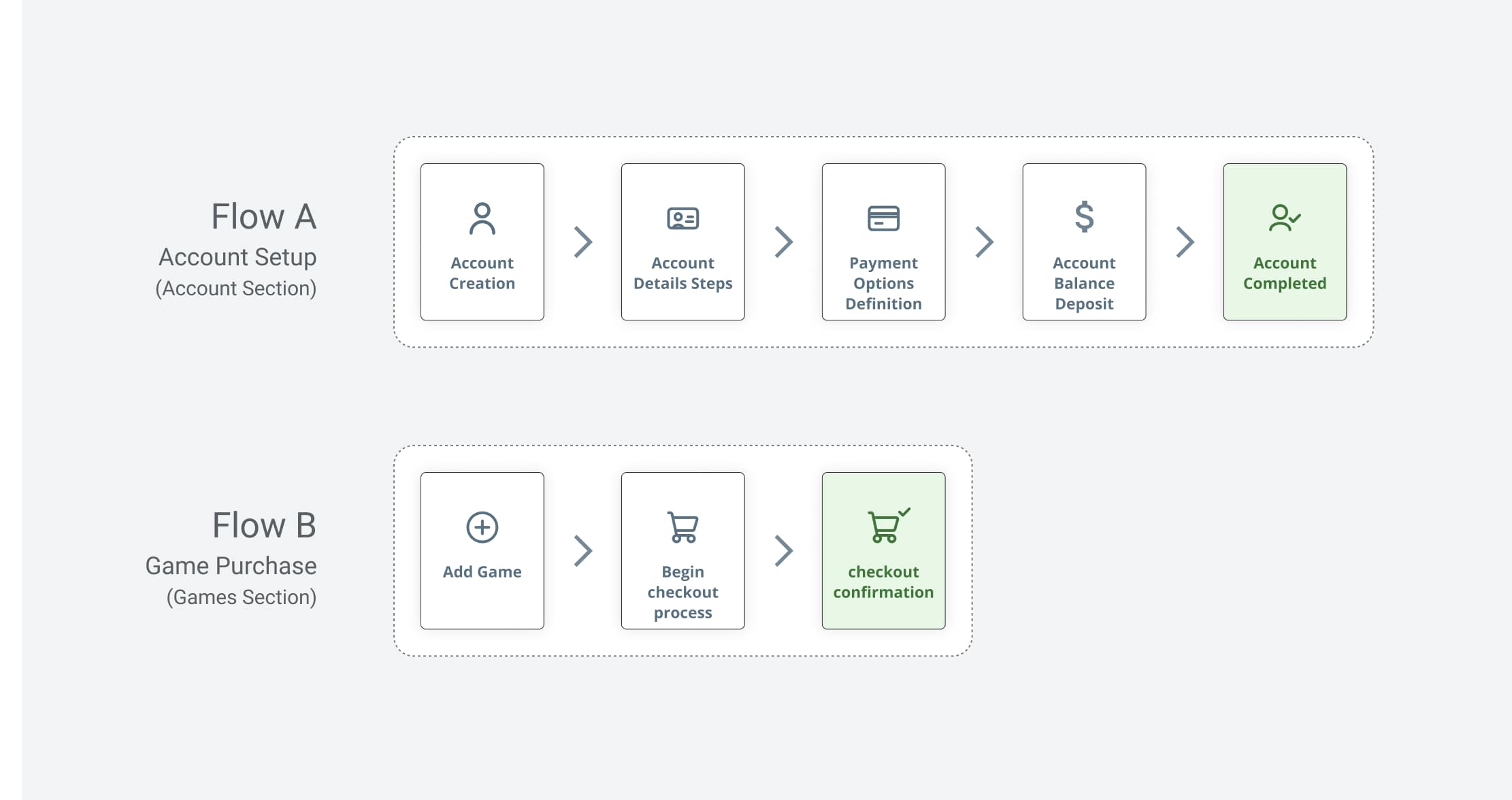
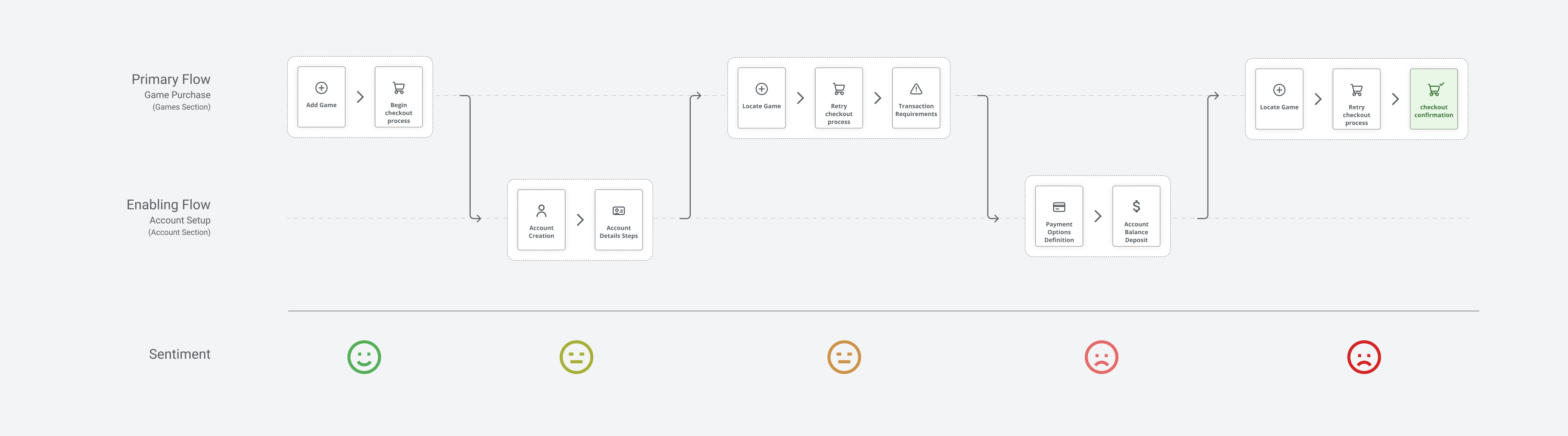
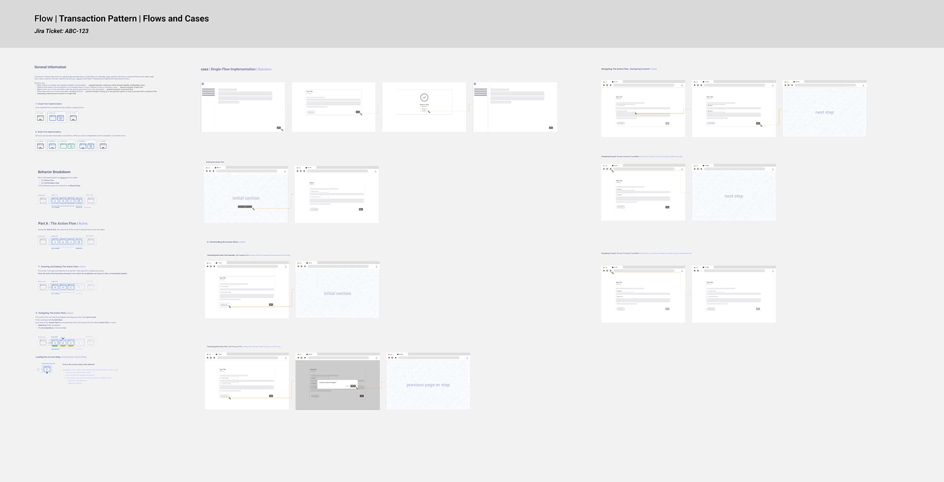
The primary flow had to work both with and without payment details set up. Payment steps would interject only when required, then return users to their original intent.
Rather than jumping to screen mockups, I worked on a reusable pattern with engineering. This allowed the backend team to build a Proof of Concept in parallel. Early discussions ruled out modals: pages needed backend submission and reloads, and the back button would lose all progress.
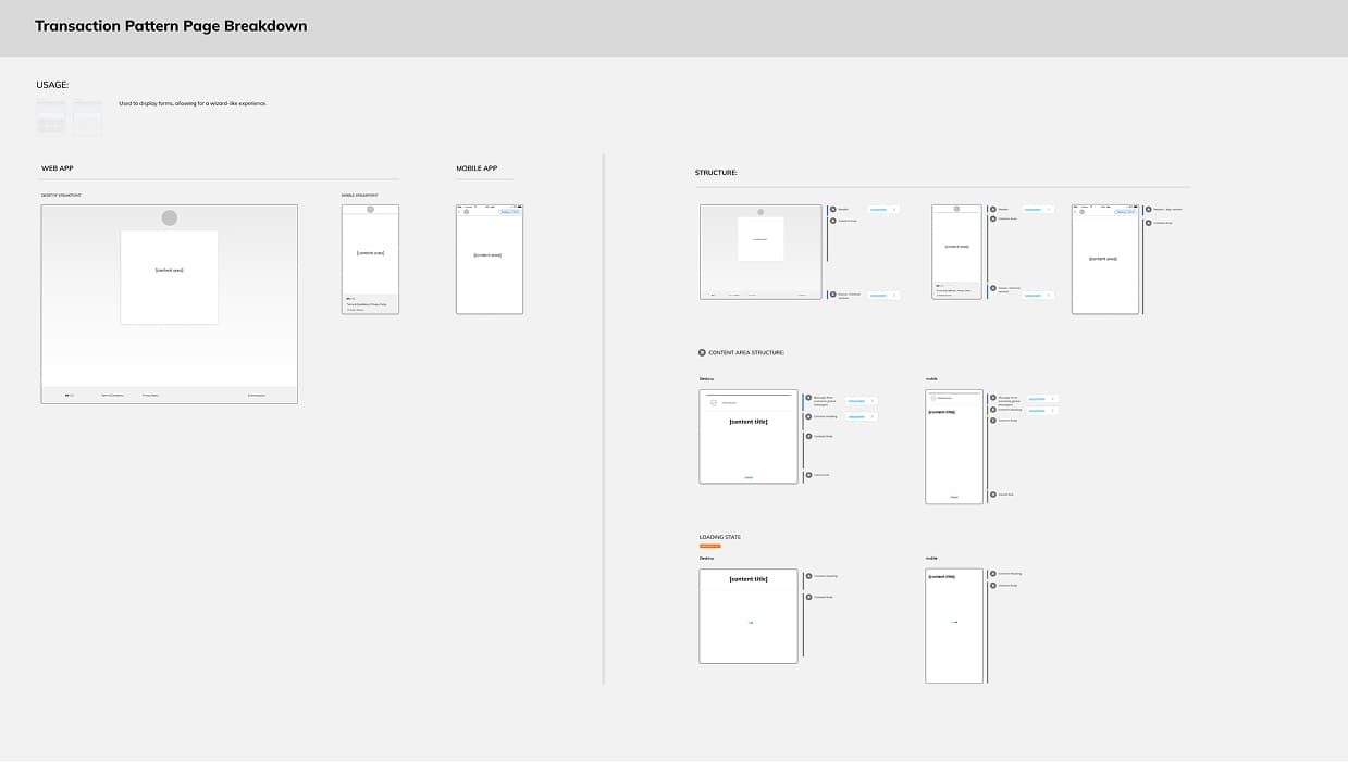
The pattern unified previously duplicate flows, reducing complexity for engineering and enabling reuse across the app.
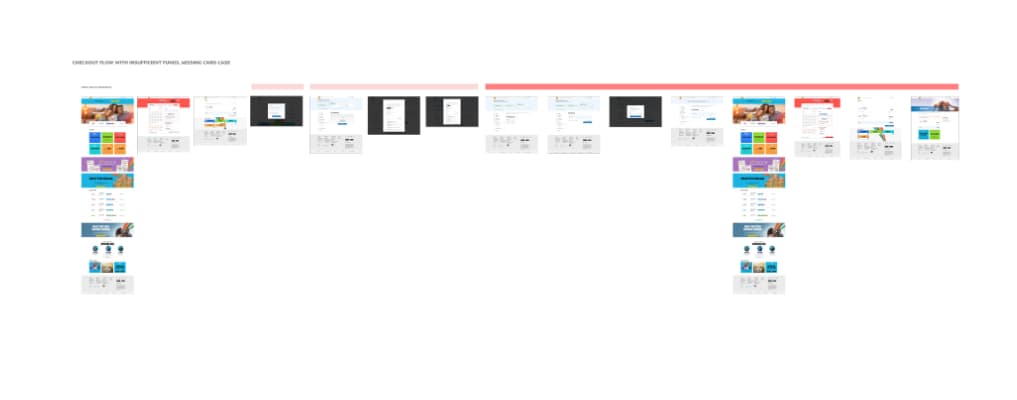
Usability Testing
As the final step before handoff, we tested with 10 users.
Key feedback
"Ok, that was fast. This was a very easy checkout process."
In testing, severe navigation issues dropped from 64% to 0% compared to the previous version.
Results
This release was foundational. It enabled a series of subsequent features over the following year.
Results
This release was foundational. It enabled a series of subsequent features over the following year.
- Task completion in testing
In baseline testing, roughly half of users completed the purchase flow. After redesign, all users completed successfully.
- Enabled by unified pattern
The new architecture enabled rapid delivery of additional payment methods, card scanning, promotional capabilities, and the launch of a fully reusable new game category within one year.
- App store rating recovery
Rating increased from 2.0/5 to 4.4/5 over the following year as the unified transaction pattern resolved the main navigation breakdown of the primary user path and allowed for many new additions.
Reflection
When symptoms are scattered across different pages and teams, the underlying cause is often structural. Systematically connecting issues to evidence made the root problem visible.
The platform was designed for how the team thought users would behave. It needed to be redesigned for how users actually behave.